Aqualine Logo Refresh

The original Aqualine logo was heavy with background textures, multiple outlines, and extra text that made it less versatile.
For the refresh, I kept the core typography intact but modernized the presentation:
• Removed tagline (“Plumbing + Irrigation Products”) for a cleaner, more scalable mark.
• Eliminated drop shadows for sharper, high-contrast readability.
• Simplified color palette for stronger brand recognition.
• Refined water drop inside the “Q” as a subtle but memorable brand symbol.
• Removed textured background for easier use across all media.
The result is a cleaner, more confident logo that’s easier to reproduce in both print and digital applications, while still keeping the brand’s recognizable shape and type style.
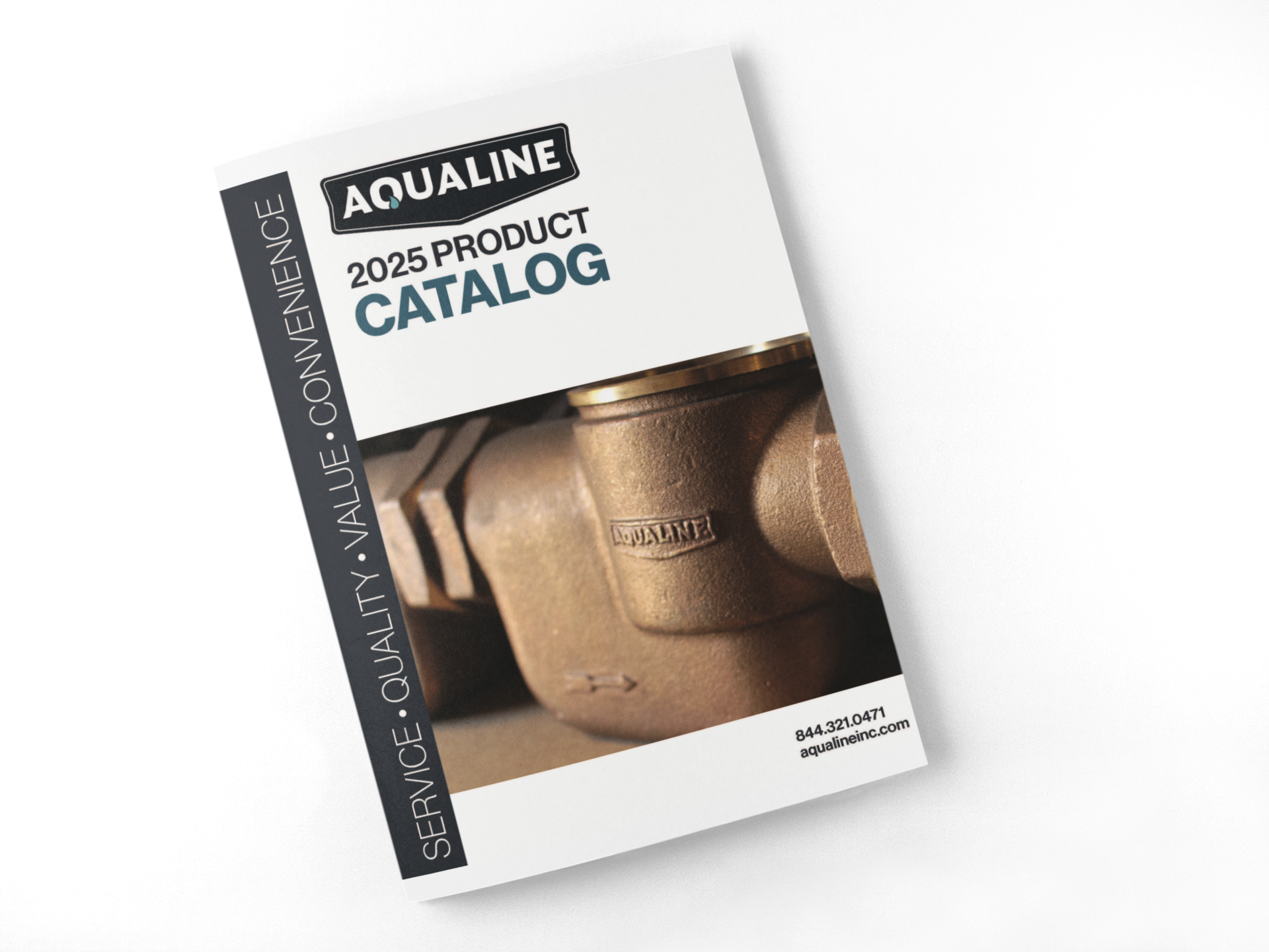
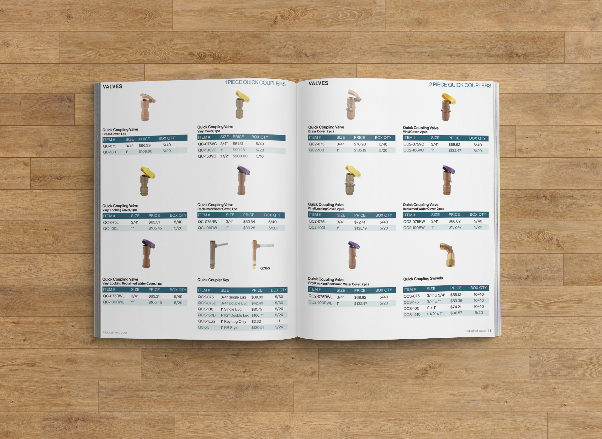
2025 Aqualine Product Catalog
Designed using the refreshed Aqualine branding for a clean, professional look. The layout emphasizes clarity, easy navigation, and consistent application of brand colors and typography across 100+ products.